Dibuja tipografía para libros, marcas y pantallas
Crea una fuente para una publicación o campaña, o redibuja un nombre que pida un tratamiento especial. Trabaja aquí las letras y llévalas a tus herramientas de diseño.
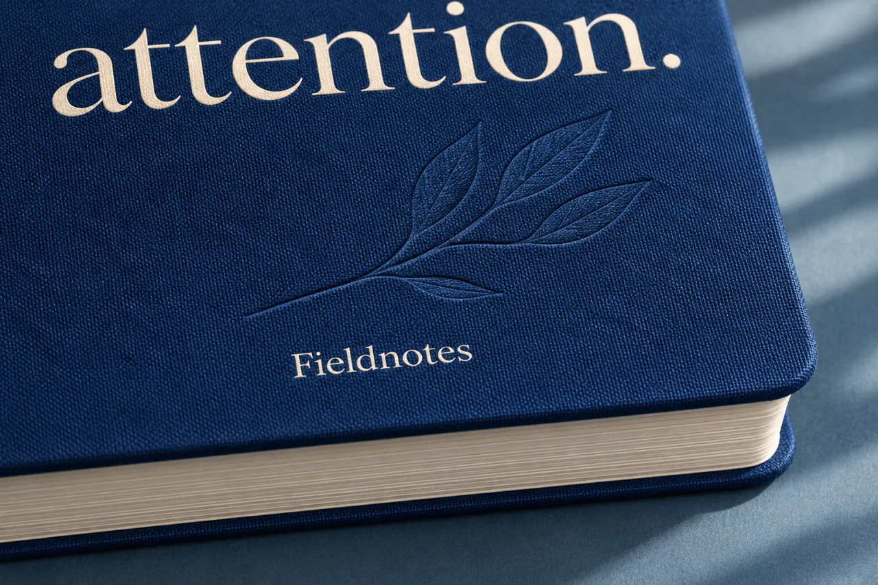
Las mismas formas cumplen distintas funciones según la escala
El título de un libro destaca sobre el texto de lectura. Una etiqueta debe leerse a una distancia corta. Un cartel tiene poco tiempo para captar la atención.
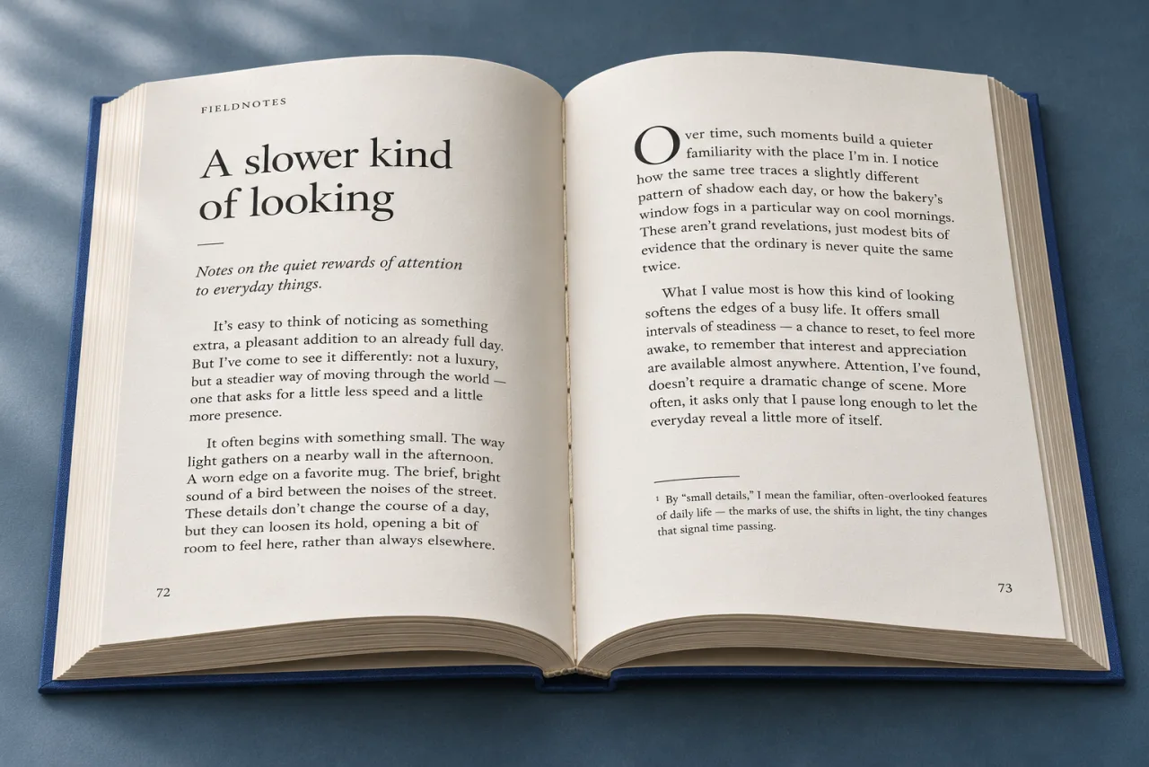
Give a title presence, then let the reading settle into its own rhythm. Consider paper, scale and the distance between the two.

Fine lettering on glass. A generous initial on paper. Think about what the surface brings to the same identity.
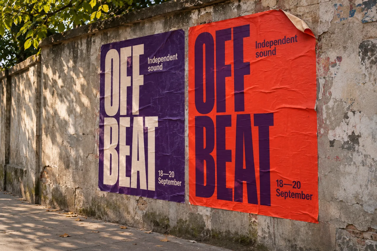
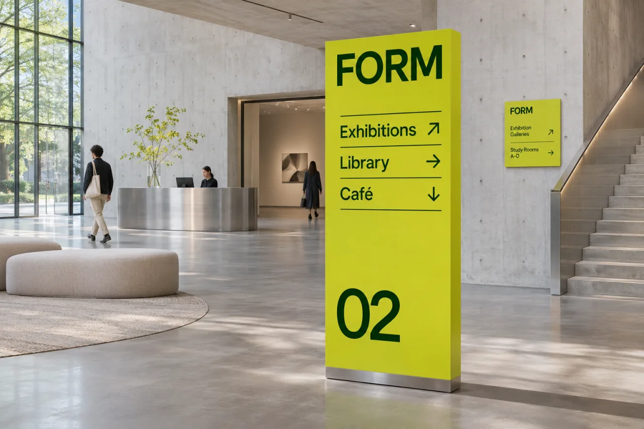
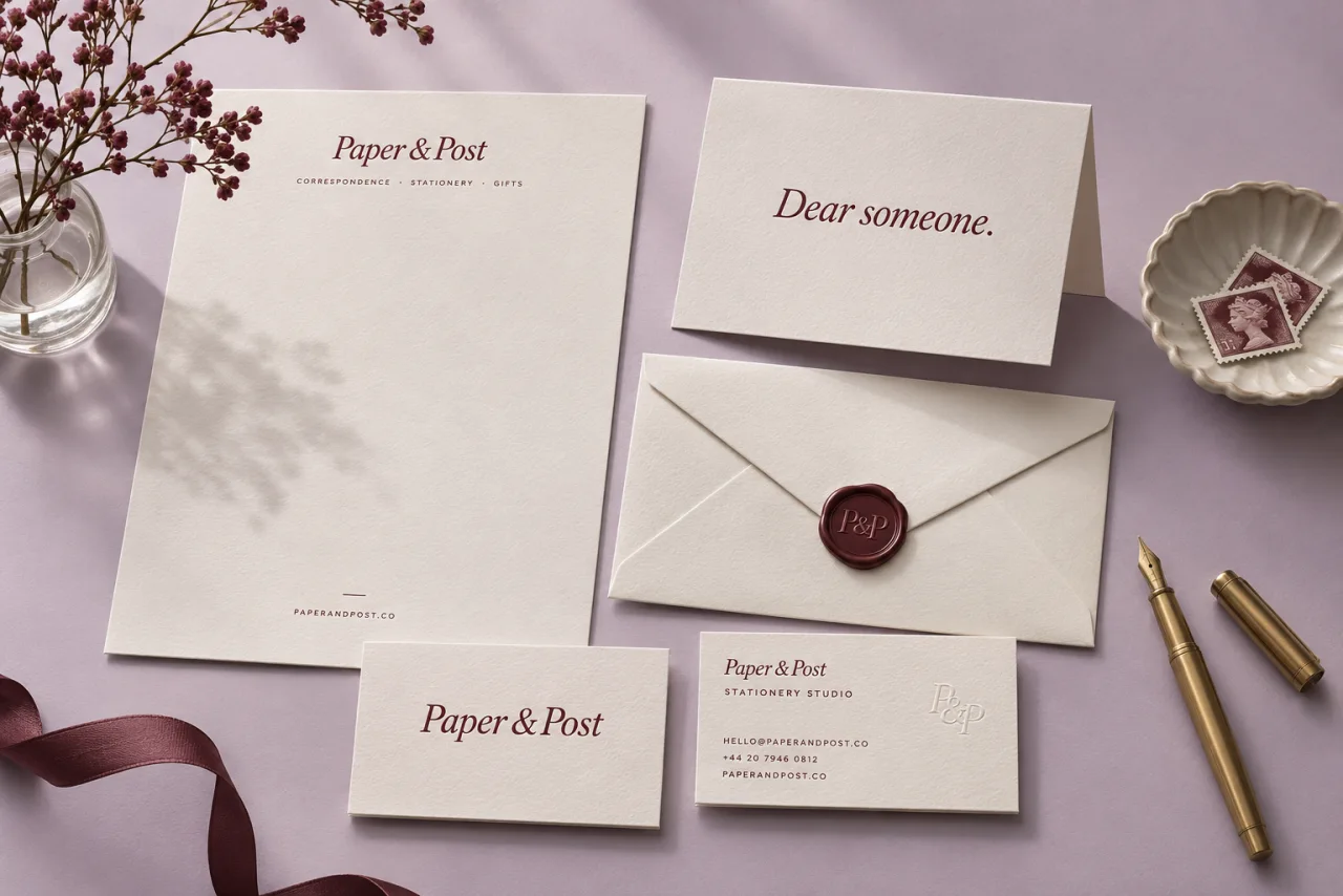

Concept applications. Create the font here; compose the finished designs in your design tools.
Present the whole idea.
Preview your font in text and product layouts. Keep the family and its styles together while you judge how the type reads.
See font Preview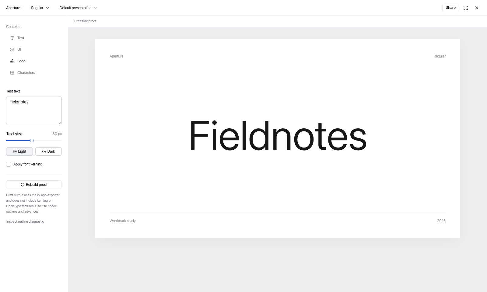
De la letra a la composición
Decide para qué necesitas las letras
Si vas a componer textos distintos, dibuja una familia o importa una con licencia. Para dibujar un nombre en concreto, abre Wordmark.
Prueba con tus propios textos
Dibuja los contornos, ajusta el espaciado y lee una prueba con tu texto. En Wordmark puedes mover o redibujar una sola aparición de una letra repetida.
Lleva las letras al diseño
Exporta la fuente para tu diseño o web, o coloca el SVG de Wordmark en tu herramienta de diseño. Comprueba las letras al tamaño y la distancia a los que se leerán.
Something only you would make.
Start from a direction or go straight to the letterforms. Your judgement stays at the centre.