Draw type for books, brands and screens
Build a typeface for a publication or campaign, or redraw a name when a single word needs special treatment. Make the letters here and use them in your design tools.
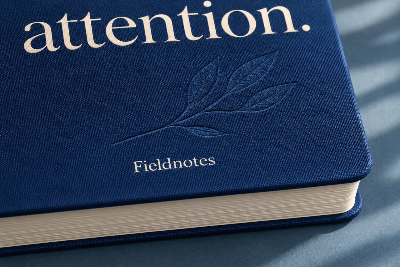
The same letterform has a different job at every scale
A book title needs presence above quieter reading text. A bottle has to read at arm’s length. A poster may have only a second to catch your eye.
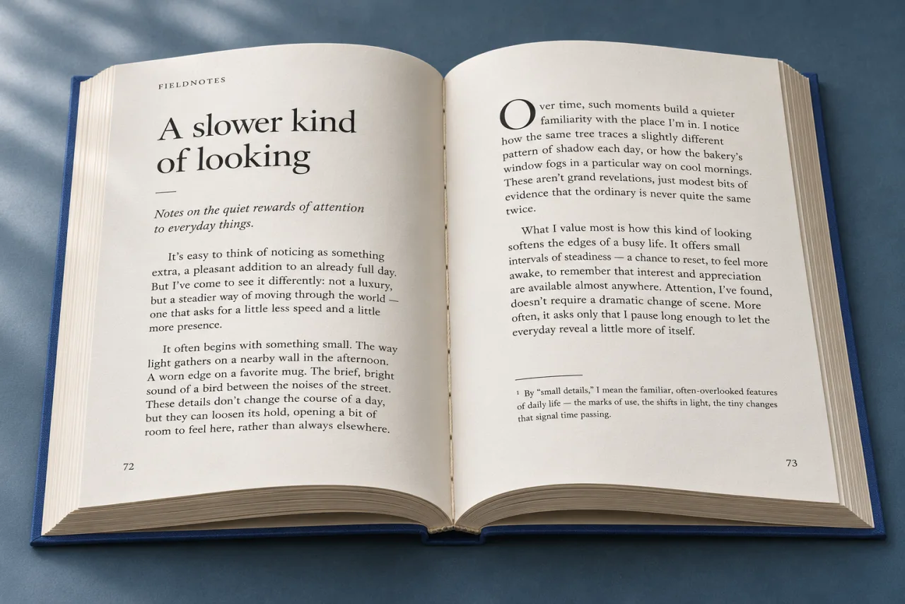
Give a title presence, then let the reading settle into its own rhythm. Consider paper, scale and the distance between the two.

Fine lettering on glass. A generous initial on paper. Think about what the surface brings to the same identity.
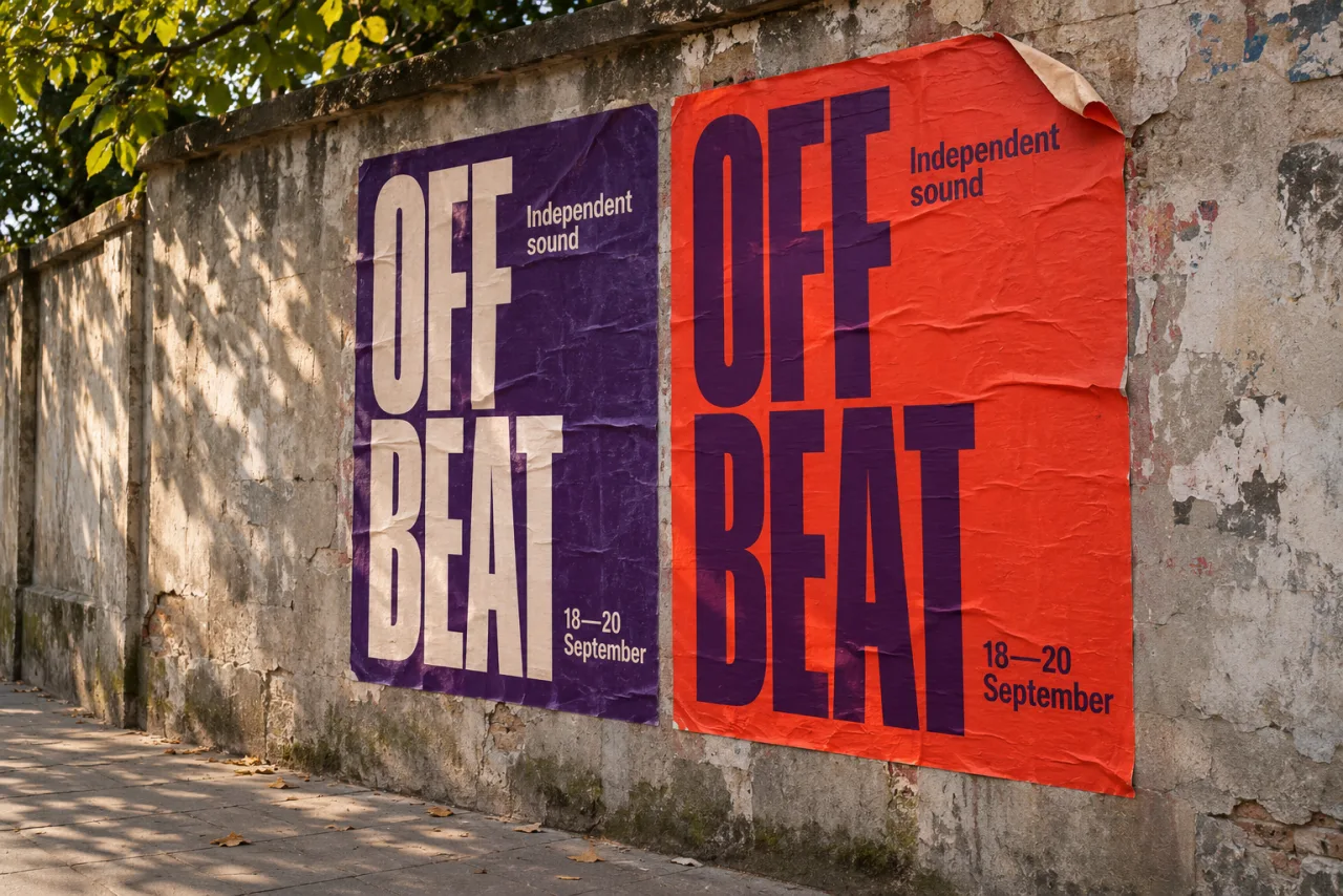
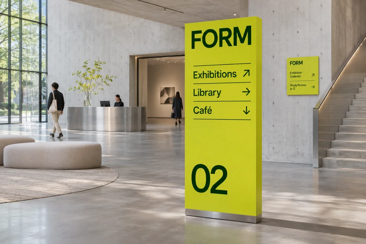
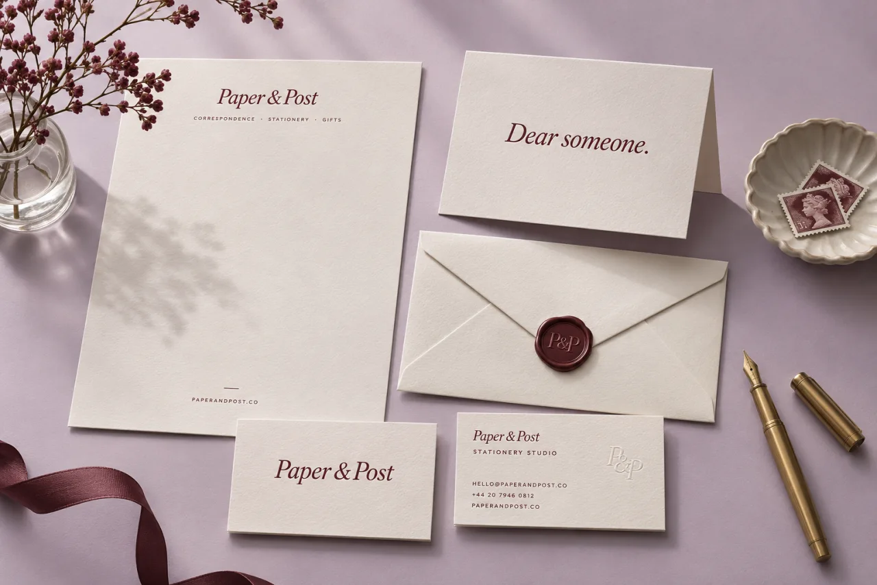

Concept applications. Create the font here; compose the finished designs in your design tools.
Present the whole idea.
Preview your font in text and product layouts. Keep the family and its styles together while you judge how the type reads.
See font Preview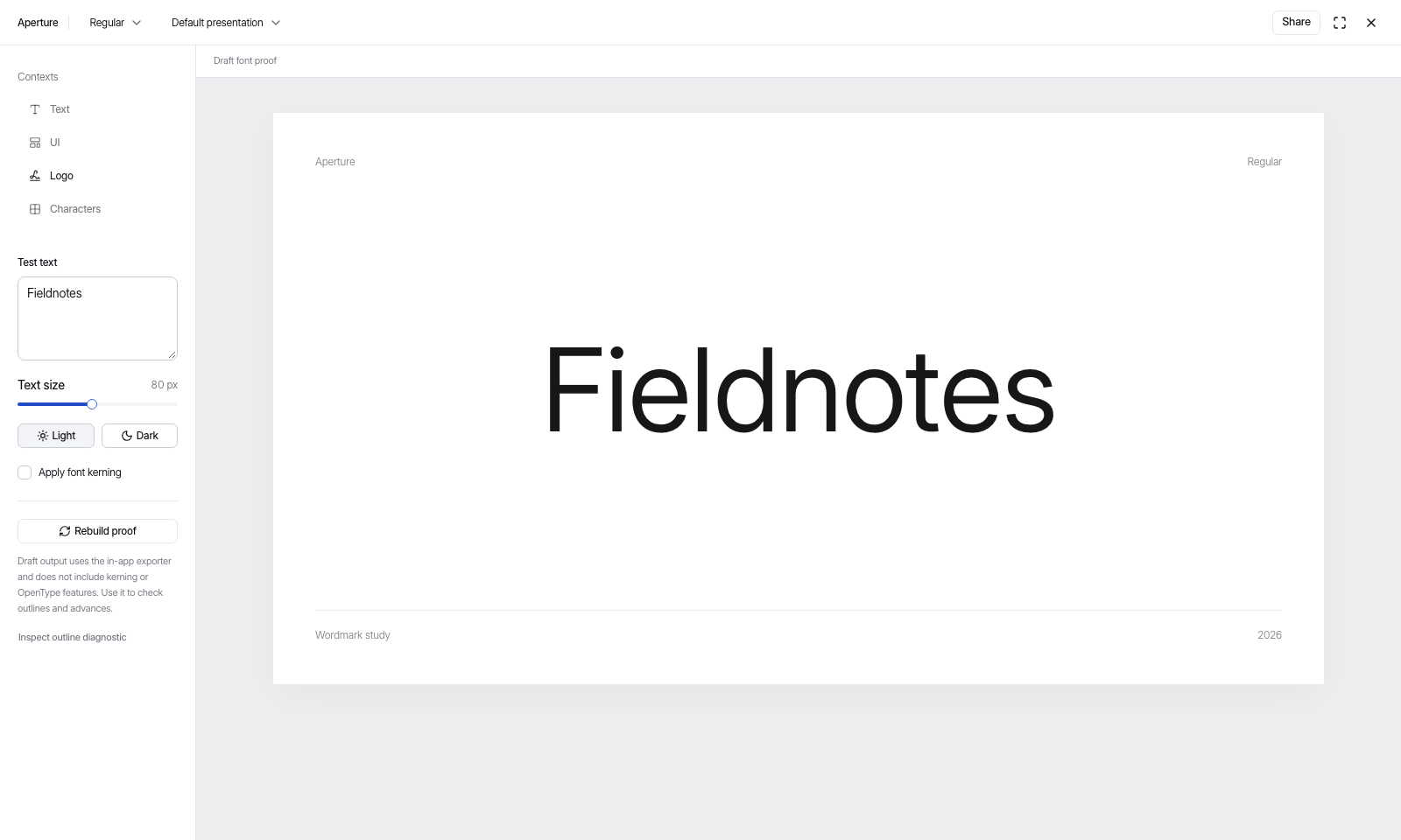
From the letter to the layout
Choose the job for the type
Decide whether you need reusable text or lettering for one title. Draw a font family from scratch, import a licensed family, or open Wordmark for a single piece of lettering.
Inspect the actual words
Draw the contours, adjust the spacing and read a proof with your real copy. In Wordmark, move or redraw a single occurrence of a repeated letter.
Take the result into the design
Export the font for your layout or site, or place the Wordmark SVG in a design tool. Judge the letters at the size and distance people will read them.
Something only you would make.
Start from a direction or go straight to the letterforms. Your judgement stays at the centre.